Latest Updates
Showing posts with label Six Color Wheel. Show all posts

Leveling Up - Color Matching Brand to Brand

Now I'm a self admitted Reaper fan and I'm heavy user of both their MSP and HD paint lines. However, I don't let that stop me from trying out other brands (I use Vallejo, some P3 and a smattering of GW along with a small selection of washes from Secret Weapon). Since I have been collecting Scale75's ScaleCoat paints I thought I would push forward with some color matching and see if I could match the six Reaper colors that I have been using to create my six color wheel. The ultimate idea would be to create a six color wheel using the Scale75 paints. I'm using these six colors from Reaper because of a question I had asked Anne. Of course she didn't just give me a quick answer, she responded on the Reaper forum and pretty much hit a home run with it. Not only did she list the six Reaper equivalents I asked about (and they are only equivalents not exact matches) she told us how to do our own color matching. So that is what this particular exercise is all about seeing if there are any close matches between the "Reaper Six" and Scale75.

So here are the colors that make up the "Reaper Six" along with their, roughly, artist color equivalents:
Republique Red (61108) -  Cadmium Red (a warm red)
Crimson Red (29801) - Alizarin Crimson (a cold red)
Ultramarine Shadow (9187) - French Ultramarine Blue (a warm blue)
Sapphire blue (9016) - Cerulean Blue (a cold blue)
Clear Yellow (9095) - Cadmium Yellow Light (a warm yellow)
Sun Yellow (9008) - Cadmium Yellow Medium (a cold yellow)

We need to compare swatches of color directly against other swatches of color. To do that we are going to make a tool that will surround one color with another to get a good match. I know that sounded weird but basically we are going to make squares of color and cut the middle out. We will lay the open square over the color we want to match and see if we are close. The pictures probably explain it better:


Took one of my art journals (with perforated pages) and layed out a series of squares. The big square is 1 1/4 inches on a side. The square in the middle is a 1/2 on a side. That leaves 3/8ths of an inch for our color on all four sides of the center square.

So something like this

Cut out and ready to use

Important point, You should label the colors on the back, in case you forget what you were using, and you may as well put the stock number as well.

And from the front

A selection of the Scale75 ScaleCoat Blues plus one yellow (there are only two yellows in the whole line right now, a sad deficiency)

Now with the Reds plus the only other yellow

Reaper Color Matcher using the "Reaper Six" and the two Scale75 Color Matchers trying to see if we can emulate the "Reaper Six"

The Blue Color Matcher (plus a yellow)

The Red Color Matcher (pluse a yellow)

Republique Red is pretty close to Antares Red (Reaper Color Matcher on top, normally I would compare against a swatch of color but I didn't want to get the paints back out)

Crimson Red is a bit darker than Deep Red (the darkest red that Scale75 makes). Probably close enough in the long run.

Clear Yellow is a tad lighter than Sol Yellow. Again probably close enough for our purposes
. 
Sapphire Blue is a bit darker than Mediterranean Blue. Mediterranean Blue is not as "cold" as Sapphire Blue. 

Ultramarine Shadow is a bit lighter its closest match Navy Blue. Navy Blue is not as "warm" as Ultramarine Blue

I didn't even bother comparing Sun Yellow against Tenere Yellow. They aren't even close. In fact I might argue that Tenere Yellow isn't a yellow at all, its almost ivory in color. I suppose it might be a yellow tone.

So that's the tool. Its small enough to fit in my journal that I'm tracking my ReaperCon 2015 projects in and that will also help flatten them out. I'm thinking I need to mount them on a thicker stock of something. I'll figure that out later.
Leveling Up - Experimenting with Color Theory Part 2

This week my Republique Red arrived in my Reaper Miniatures order. I went back down to the workroom to do a new "primary" color wheel. The light finally went on that the reason you use six colors to create this wheel and its variants as that each primary color has both a warm and a cold version which is why sometimes when I mix red and blue or blue and yellow or yellow and red I don't quite get what I'm expecting. A cold yellow and a cold blue are going to create duller greens than a warm yellow and a warm blue. So that little bit of understanding will really help in my color choices especially for the dioramas, maybe a little bit for the display base pieces as well.

So here is the new version of my Reaper Color wheel. I'm still having issues with the shades and the grey tone so I have left those rings empty again. I may go ahead and do the alternate rings, matching up say the republique red with the ultramarine blue to see what range of purples that creates (that would be a warm red combined with a warm blue). I might pull out my Scale75 Scalecolor paints and try the same exercise with those.

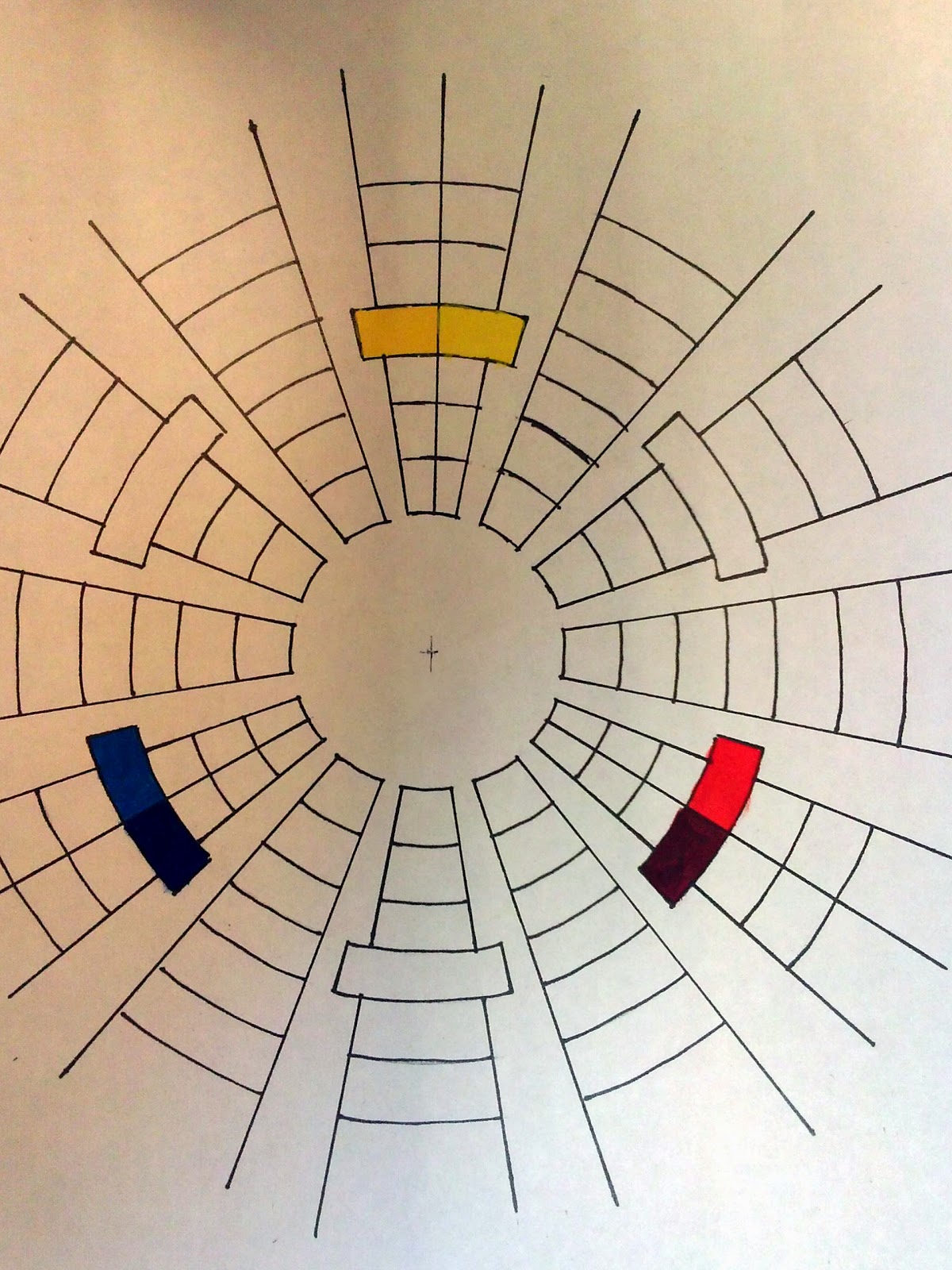
Starting at the top: Sun Yellow (9008),  Clear Yellow (9095), Republique Red (61108), Crimson Red (29801), Ultramarine Shadow (9187) and Sapphire Blue (9016)

Adding in the secondary colors (1:1 mix)

Adding in the tertiary colors (approx a 1:1 mix of the secondary and the primary on that side)

Adding the "tones" just adding white in a 1:1 mix

Adding the "tones" for the secondaries, again white in an approximate 1:1 mix

Adding in the "tones" for the tertiaries (even more approximate!)


Leveling Up - Experimenting with Color Theory

I have been painting at a high silver level for a long time, I haven't received anything lower than a silver medal at Reaper for three years now. The issue is I'm not hitting the gold level either. So for next year's ReaperCon (as well as Genghis Con) I'm really going to try to push the envelope and getting over that gold finish line. My objectives are quite ambitious, but I'm at the "Go big or go home" stage. I currently have plans for three dioramas, four conversions, four singles and one vehicle. All selected to really push myself. I'm aiming for a gold in each of the four categories and I want my Reaper entries to be at least considered for a Sophie, whether I get one isn't relevant (I have two silver Sophies but that was before we went to the medal format, still more than most people!), I just want to make the cut for Sophies.

With that in mind I have been playing around with basing, the results of my last two posts, and really paying more attention to colors. I asked Anne a lot of questions after the convention and she recommended a book "Color and Light" by James Gurney (creator of Dinotopia). I acquired the book and I have been sifting through it for a couple of weeks now. I also figured out (thank you Anne) why the color wheels you can buy are pretty inadequate for our needs. While I understood basic color theory the concept of a six color wheel really turned on some lights for me.

I asked Anne, again, about which Reaper colors were close to the artist tube colors in the example I saw. What she suggested were close, but weren't going to be exact, its kind of the nature of the pigments and the various chemical processes used to make our paints. Oh and by the way, all hobby paints are made with liquid pigments, so why Privateer Press thinks that's a selling point is beyond me. What's really important is the base, its the base plus the pigments that give us paint.

I started the color wheel today. The results were not quite what I expected. Part of that is I'm using hobby paints which are going to behave a bit different from the artist colors. I think the other thing that gave me some odd results is that I just don't know what ratios they really use to get the tones and the shadows. They talk about adding white, a little more white and then a little more white, which is far from exact. Also I'm not sure if the shadow colors should be mixed from equal proportions or by adding just a dab, the same with the grays. Anyway just more for me to think about.

Here is the color wheel that I managed to create today. I didn't quite finish it since I'm not sure I was creating the shadows and grays correctly. 


The location where I keep pictures created this graphic. Kind of cool.

Adding in the reds and yellows. All from Reaper; Ultramarine Shadow, Sapphire blue, Clear Yellow, Sun Yellow and Crimson Red. I'm missing the Republique Red which is out of their Heavy Gear Paint range, I'll have to order that. So this wheel is actually a variation of the one I intended to make since it just uses one red instead of two.


Creating the violets. There isn't a lot of separation between the colors, I may have to add more ultramarine blue on one side and more crimson red on the other.

Filling out the "secondary" colors. Didn't really get the orange I was expected. The green looks okay.

Creating the tones for the secondary colors by adding white. I'm just not sure I added enough white (same for the primary colors"

The tertiary colors going in and getting their tones

The wheel's inner ring is complete

The shadow is in the fifth ring, the main color plus its opposite. I mixed 50/50 here and that might be to dark. The "gray" is the shadow plus white. I'm pretty sure that I have this mixed wrong.

My idea here is to be able to create a unique color wheel for each of the entries based on the main primary colors I'm using. From this I can also create a gamut map which would let me select a limited palette and be confident that everything will work together and that I can create every color within the map.